Saturday, March 21, 2015

Poster Art - Woot!


I've said before - it's not just what you can do but who you know. Well, this is a perfect example of that. I can kind of draw, I mean if you're looking for something kind of cartoony and computer generated I'm your go-to person. However, that kind of style does not fit The Lottery at all. We've got some uber talented people on campus, but they are so busy painting sets and things that poster work gets put on the back burner. However,  I happen to have two of the most talented artists you will ever meet as my own children (and no, I'm not saying that because they are my kids, I'm saying that because they are remarkably talented people). Case in point...this is the poster that my amazingly talented older daughter designed for my upcoming show. I love it!

Friday, March 20, 2015

Prop Scavenger Hunt

Are you familiar with the story of The Lottery? If not I highly recommend you go and check out the short story here. It's one of my favorites short stories, I love the character development and all of the wonderful symbolism. When I had the opportunity to direct the play adaptation of this story I was thrilled. It calls for no setting (seriously, a completely bare stage, but I have added a tree stump because I think it looks ridiculous for Belva to be knitting while standing) and very minimal props. Because the props are so minimal, I want them to be spot on. The major prop I'll be focusing on is the black box (again, if you have't read the story, I highly suggest you take a moment to venture over and do that, otherwise the extreme significance of the black box is well, less extreme.)
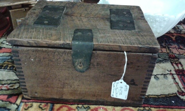
So, one of the goals I had for this spring break was to find a box for this prop, or more accurately the inspiration for making one. I didn't expect to find the perfect one, because, well, I am self admittedly pretty picky. However, when I was digging around at one of the flea markets I found this gem.

It's pretty close to perfect (except for the fact that it's not actually black and that I would have to paint it) however, the price tag is very far from perfect. Because of the age of the box (estimated mid 1800s) it fits perfectly with the story, but, that would also mean that I would be defacing an antique and I'm not really okay with that. I much prefer to recreate props if alterations need to be done to them over stripping a piece of it's value. So, thanks to my moral code of antiquities I didn't come home with the box (heaven knows if it had been black I would have dropped the $47 and brought it home even though that is way more than I normally spend for props).
So instead, I'm going to be spending some time in the shop next week with the help of my incredibly talented shop friends creating a box that looks to be at least 150 years old and slightly dilapidated. That was actually one of the things that would have made this box better (and probably cheaper!) if it looked like it was coming close to major repairs or replacement.

One of my favorite parts of this box is the way the lid works. First of all, check out those completely awesome leather hinges that have been nailed onto the box (note to self, we need to find some aged leather). I'm thinking that this was done out of convenience, that the original creator probably didn't have the metal hinges in the barn, or shed or whatever and so they used a bit of spare leather (maybe from a set of reigns or an old belt - it seems to be about the same width) (second note to self: look for an old belt at second hand stores to make into the leather hinges). The hinges add a wonderful handmade look. 

But the real thing I love about the way this box opens is the fact that only half of the top opens. This may seem impractical (heck, I have no idea what the original intent for this box was) but for my purposes it's perfect. The lottery is all about a drawing, one where it's best if the person selecting their bit of paper isn't aware of what's on it in advance. By making the opening smaller it makes it much less likely that an individual could look inside the box as they were churning the papers around and be more selective about just which one they pulled out. Of course, it doesn't say anything about such a design in the story or the props list for the play, but remember what I said about having a thing for the symbolic? I crave symbolism, I want things to have a deeper meaning than what lies on the surface. I honestly want the audience to be able to watch the show (any show I work on) multiple times and catch something new each time they see. it. The construction of this box is no different. Plus, we'll be working on a much smaller stage with a much closer audience for this show. Every minute detail becomes increasingly important the closer the audience is to the action.

Saturday, March 14, 2015

Script Color Coding


Okay, I admit I have a bit of a color coding obsession...maybe a lot of one. I color code my planner (which makes it highly effective, thank-you-very-much), I color code my folders and notebooks to coordinate with the textbook for the class, I color code my notes (which makes for easier and more effective studying), but most of all I color code my scripts. Now, if you've never worked as a stage manager you might not understand the need for such a thing, but I can assure you, it makes my job worlds easier.


Color coding scripts is not only effective for calling the show, it's a great tool for making all of those lists that the directors will ask for at some point in the show. I'm sure other stage managers have their own system for marking scripts, this is just the one I've devised based on the shows I've managed and the needs for those shows (as well as the colors of highlighters/pens/colored pencils/papers/dividers that I could coordinate because when I color code things I want it to all be matchy-matchy).


The standard color system I use is simple:

scenery - green
lights - yellow
sound - blue
costume - pink
props - purple

For some shows you will find that there are more elements to code. For example, when I work a musical, I opt to mark "sounds" in one color and "music" in another. This is helpful in calling the show because there is often one person running the sound effects while another is running the music or directing the orchestra. For one of our shows the playwright (who was working in conjunction with our theatre company) called for several projections to be played behind the action of the play. The projections had to be created and incorporated into the cues of the show. Another show had several different flies that had to be orchestrated into the cues. Another show made use of a fog machine several times throughout the action and I dubbed this as "effects" and also gave it a specified color.

music - dark blue
projections- orange
flies - red
effects- dark green

Each one of the five main sections listed has it's own divider in my prompt book and I keep all of my lists and notes in the appropriate section. I also print my lists on coordinating colors of paper which makes it much easier to help directors find that piece of paper they "never got". (Director: Where's the props list I asked you for last week. Me: I brought it to your office last week. Director: No, I'm sure I never got it. Me: It's purple. Director: Oh, here it is. Thanks.) The optional sections aren't part of the standard prompt book development and don't have a standard divider, but I do include them. sometimes I can't color coordinate the dividers as well but the cues are marked according to the colors listed above. [Side note: there is a prompt book post in the works.]

Recently I found the "Retractable Highlighter" pack (the ones with the funky tribal tattoo designs) that had not only the illusive purple highlighter, but also an unheard of red highlighter. The pack was pretty cheap (woot) and being retractable I don't have to worry about loosing the lids (woot woot). I found a similar set on Amazon in case you're looking for some. The pens I use are flair felt tips that can be found most anywhere, but here's the package I have from Amazon. I also use a brown and a grey flair pen, and those I ordered from Staples.

Saturday, March 7, 2015

Mort...Mork...Morgue (Really? Yes, Really!)

In our directing class meeting last week we talked about more things to be adding to our journals (gotta show the administration that yes indeed we are working, never mind the fact that we're producing shows here but whatever) and the instructor mentioned a sort of idea scrapbook where we could put a bunch of images and sketches and things and my little heart became oh-so-happy because I just love things like that. So I asked him again what it was that he was calling this wonder of wonders and I was pretty sure he said morgue, but that doesn't make a lot of sense (I mean it didn't until I analyzed it deeper but that comes later) so I asked Em (who is also in the directing class with me and she thought he said mork...maybe mort. So, I though we would ask the modern day oracle Google and see oodles of examples of these wonderful books but no. In fact, I couldn't even figure out exactly what this was called. Since I had already asked the instructor to repeat the word a few times in class I didn't want to go back to him and say I couldn't understand his diction so I went and talked with our musical director who told me it was in fact a morgue. At that point the English major in me came out and I began to analyze the meaning of the word as a file or catalog of images for t inspiration and what is a traditional morgue other than a file or catalog of bodies. After some digging (and asking Google the right questions) I discovered that a morgue is common in the newspaper world as a collection of old cuttings and photos. I imagine with our digital age this has become a more antiquated practice simply for the fact that it's easier to store things like this in a file on your laptop rather than in a notebook. However, having a bit of a fetish for notebooks and the like, I will be creating a scrapbook of sorts for my one act. Now, it should be mentioned that these are usually kept for a single aspect of the play, for example the costumier would have her own morgue and the set designer her own as well. However, that seems more logical for larger productions, so instead I'm creating a single morgue for the entirety of my show and dividing it up into sections for the main components (which I will be color coding just like the markings in my script because I am truly a stage manager at heart).